Your cart is currently empty!
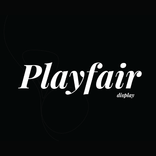
Playfair Display
High-contrast transitional serif designed for large-size display use [subscriber_button]
Description
Playfair Display is a transitional serif typeface designed by Claus Eggers Sørensen. The design draws inspiration from the late eighteenth century when quill pens were being replaced by pointed steel pens, resulting in high-contrast letterforms with delicate hairlines. The font is specifically optimized for titling and headlines, with large x-height and strong vertical axis. Playfair Display pairs beautifully with simpler sans-serif fonts for body text. The family includes regular, bold, and black weights, each with italic versions. Its dramatic contrast and refined letterforms evoke a sense of luxury and sophistication, making it ideal for editorial design, fashion magazines, and luxury branding.
